R Tutorial
April 30, 2019Enjoyed looking at the maps featured on the Mapping Early American Elections (MEAE) site? Wish you could utilize the MEAE dataset to make your own maps, but are not sure how to get started? You’re in luck! The following tutorial will teach you how to combine MEAE data with historical geospatial data to create basic choropleth maps (maps which show geographic regions colored or shaded according to some variable) in R.
While we are going to demonstrate how to make maps for Maryland’s First Congressional election, these steps can easily be replicated to create maps for different Congressional elections and for different states. By the end of this tutorial, you will have learned how to make a map similar the MEAE map for Maryland’s 1st Congress.
Tutorial Overview and Goals
In this tutorial, we will be using R, an open-source programming language used by data scientists, statisticians and other researchers and R Studio, an “integrated development environment” or application that helps one use R. We will use R to manipulate MEAE elections data for Maryland’s First US Congressional election and create two visualizations in the form of choropleth maps. By the end of this tutorial you will have learned how to:
Retrieve MEAE elections data for a selected state
Obtain historical spatial data for a selected state
Merge the MEAE elections data with the geospatial data for further analysis
Visualize this data geographically by creating choropleth maps of (1) party percentages and (2) an individual candidate’s votes
Getting Started
This tutorial will assume that you already have set up R and R Studio, and have a basic knowledge of how these tools work. (If not, R can be downloaded here and R Studio can be downloaded here. An introduction to R from the Programming Historian can be found here.) We are using R and R Studio in this tutorial because both are widely used, open-source tools that will allow us to manipulate and visualize our data. Once setup is complete, open R Studio. We recommend creating a new project, and setting up a working directory where you will store all of your information for this tutorial. You will also want to create a new R Markdown (RMD) file for this tutorial.
Next, you will need to install the packages and load the libraries that are necessary for working with the MEAE data and geospatial data. You only need to install a package once using the function install.packages("package-name-here") but you will need to load each package you want to use at the beginning of each R session with the function library(package-name-here). If there are packages listed below that you have never installed before, go ahead and install them. Otherwise, use the library() function to load the packages listed below.
library(tidyverse)
library(USAboundaries)
library(ggplot2)
library(sf)
library(scales)
library(leaflet)
About the Data
In this tutorial, we will be analyzing and visualizing MEAE data which represents the election of six U.S. Congressmen from Maryland who made up the state’s delegation to the inaugural meeting the U.S. House of Representatives in 1789.
In early America, and especially for the first Congress, U.S. Congressional elections were quite experimental. Each state set its own date for elections, and devised their own voting methods and procedures. In Maryland, elections for the First Congress were held over the course of a five-day period in January of 1789. Maryland used a combination of an at-large and district voting system for the first Congress. The state was divided into six residential districts. When voters went to the polls, they cast a vote for six different candidates—each one having to reside in a different district. At the end of the election, the votes were tallied state-wide. The six candidates with the most total votes across the state were elected, regardless of their residential district. While political parties as we know them did not yet exist, the candidates had split into two competing factions known as the Federalists (in favor of Washington, Hamilton and the U.S. Constitution) and the Anti-Federalists (who opposed the ratification of the U.S. Constitution). In Maryland’s First Congressional election, all six of the winning candidates were affiliated with the Federalist faction.
The MEAE elections data we will be using in this tutorial, once downloaded, is structured as two separate .csv files (which are like spreadsheets). The data is recorded at the county level. The file congressional-parties-meae.congressional.congress01.md.county.csv (download here) has eighteen rows of data and records the number of votes and percentage of vote received by each “party” or faction in each of Maryland’s eighteen counties. The file congressional-candidate-counties-meae.congressional.congress01.md.county.csv (download here) has 324 rows of data, with each row showing the number of votes a single candidate received in one of Maryland’s eighteen counties. We will look more closely at the elections data and the variables in each file after we read the files into R Studio.
We will be joining our MEAE data to county-level historical spatial data from the USAboundries R package, which draws its data from the U.S. Census Bureau and the Atlas of Historical County Boundaries.
Readying Elections Data for Analysis
Reading In the MEAE Data
First we start by loading the MEAE data into R Studio. The data needed for this tutorial is available from the MEAE GitHub repository. The data for party results by county is stored in this directory. You will want to select the .csv file for Maryland’s First Congressional election. You should also download the file for individual candidate results by county from this directory, which you will use later in this tutorial. Once the data has be been downloaded, move the two .csv files into your working directory.
Next, in R studio we will create a variable for our first type of data (parties) and read in our data into the variable called md1_parties. This is equivalent to opening our spreadsheet and getting it into a format that R Studio can work with. We use the command stringsAsFactors = FALSE to tell R to leave our data as strings of characters instead of converting them into factors. This will help us later when we go to join the MEAE data to the spatial data. Next, we repeat this process with the candidates data, creating the variable md1_candidates.
md1_parties <- read.csv(file = "congressional-parties-meae.congressional.congress01.md.county.csv",
stringsAsFactors = FALSE)

md1_candidates <- read.csv(file = "congressional-candidate-counties-meae.congressional.congress01.md.county.csv",
stringsAsFactors = FALSE)
We should now have two data objects loaded that represent our two types of MEAE data.
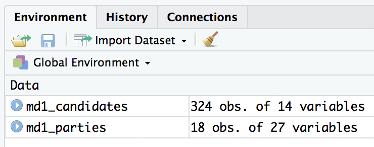
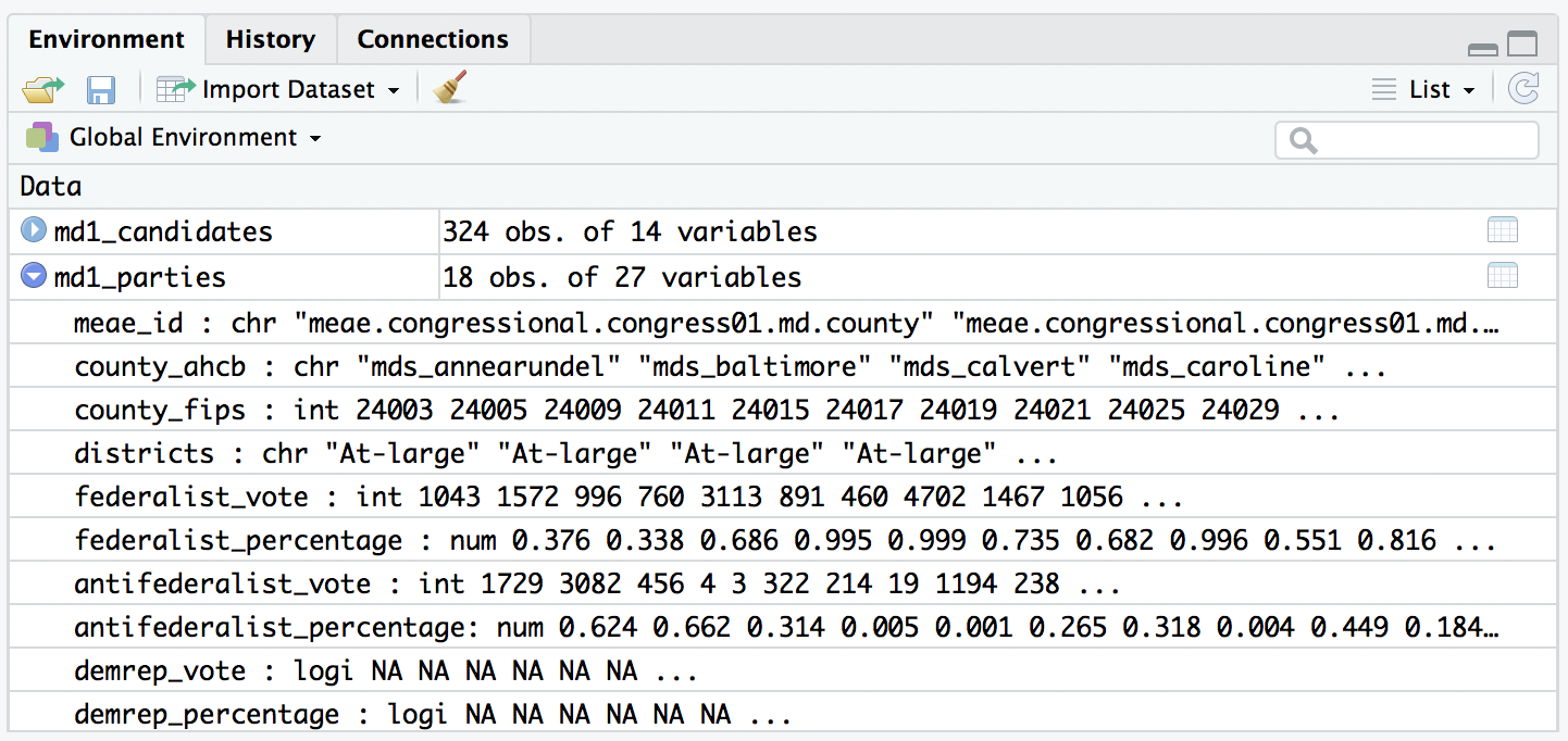
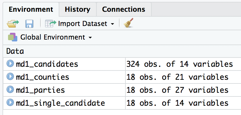
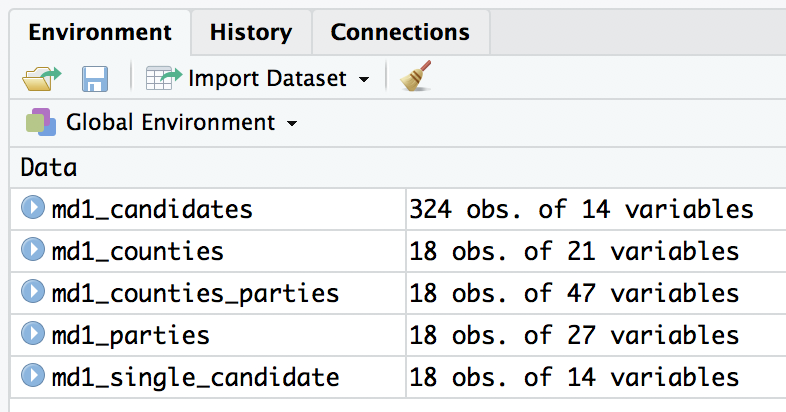
Let’s take a closer look at both data objects to make sure that our data was read in correctly, and that we understand the different variables they contain. If you are working with R Studio, look at the Global Environment window under the Environment tab in top right hand corner of your screen. You should see the two data objects we created: md1_candidates and md1_parties. Next to the name of each data object, you should see a number of “obs.” (observations) and a number of variables. The number of observations corresponds with the number of rows of data, while the number of variables corresponds to the number of columns in the data. The data object md1_candidates should have 324 observations of 14 variables while md1_parties should have 18 observations of 27 variables. Clicking on the blue arrow beside the name of a data object allows you to preview the variables and some of the observations.
Clicking on the name of a data object in the Global Environment opens it the Source Editor so that you can view or inspect all of the data. Open md1_parties by clicking its name in the Global Environment. This should open a spreadsheet-like view with a familiar column and row layout.
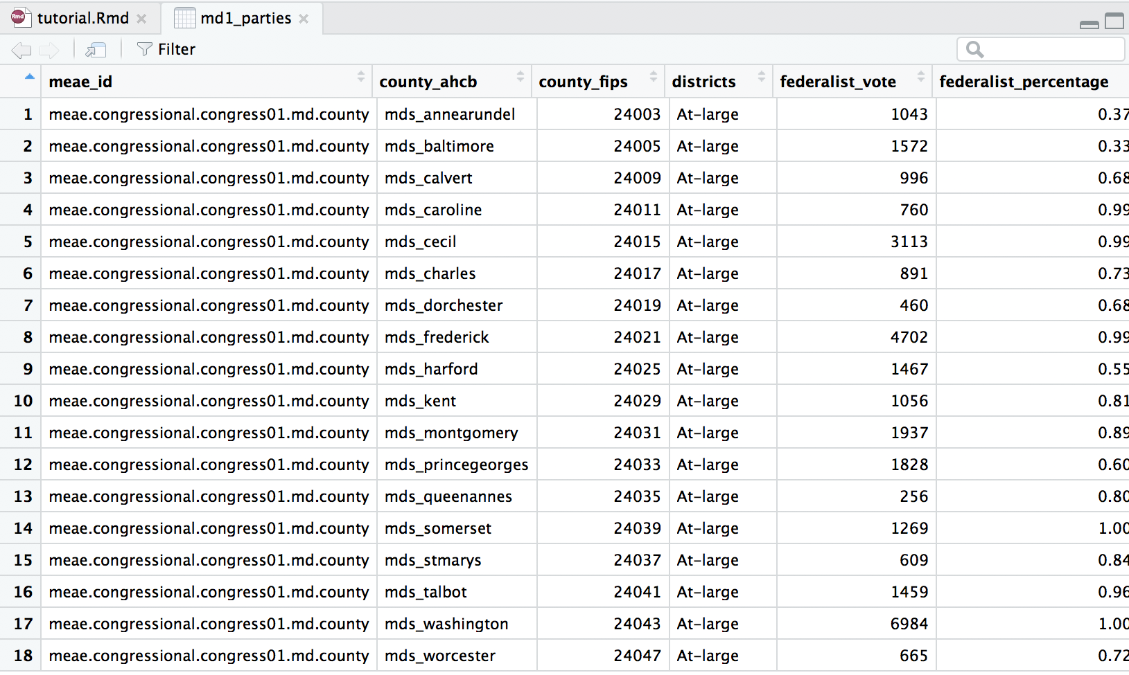
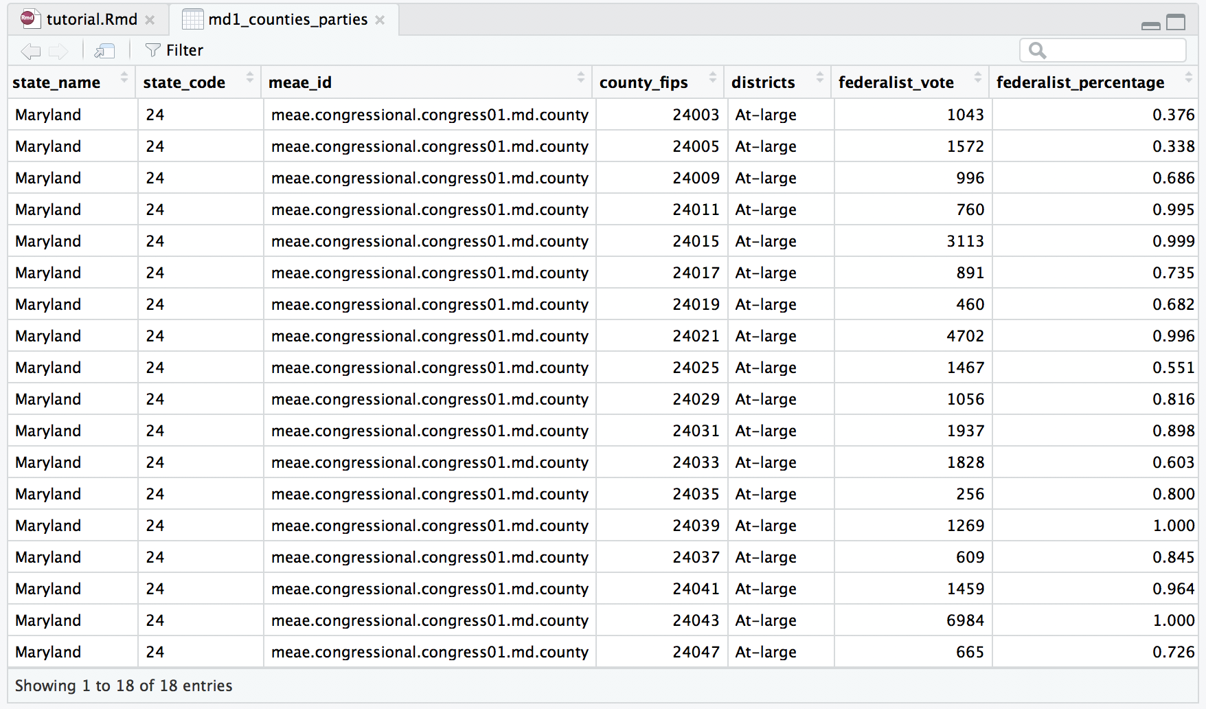
Let’s take a closer look at the data in md1_parties. This data object should contains data for the vote and percentage of the vote all parties received in this election. The first variable (column) is called meae_id. This variable contains a unique name that identifies this election in the MEAE data. You will notice that all eighteen rows have the same meae_id: meae.congressional.congress01.md.county. This tells us that all the data here is county-level data from Maryland’s First U.S. Congressional election. The variables county_ahcb and county_fips each contain a unique code for each county. Notice that each row of data represents one of Maryland’s eighteen counties. These variables will be necessary when we join the MEAE data to the spatial data.
Next, the variable districts gives information about the voting procedures in a particular election. As mentioned above, Maryland used a combination of an at-large and a district system. But to keep things simple, this election is listed as “At-Large” because voters elected six candidates that represented all voters of the state (instead of just a district or subset). Finally, the last type of variable lists the total number of votes (ex. federalist_vote) and percentage ( ex. federalist_percentage) of the vote achieved by each party or faction. Notice that the data in the percentage columns is written as a decimal with a range of zero to one. In Maryland’s first Congressional election, only the Federalist and Anti-Federalist factions received votes. If you scroll to the right, you will see variables for other parties and factions that did not participate in this election. The data for these variables should appear as “NA.”
Now, let’s take a closer look at the data in md1_candidates by clicking the data object’s name in the Global Environment.
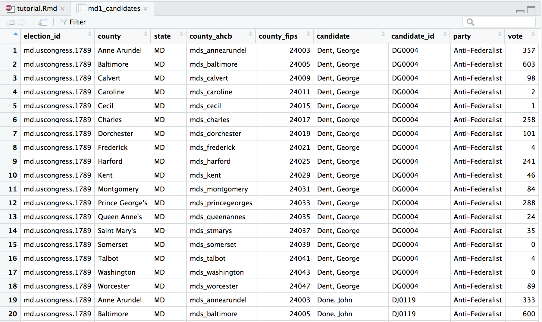
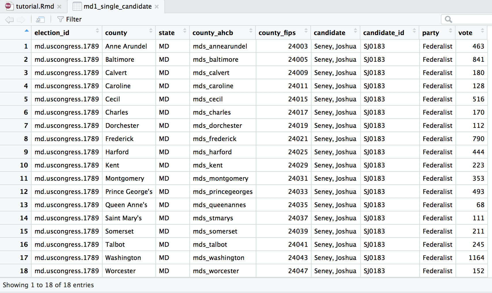
We notice that this data object contains data for all the candidates that received votes in this election in Maryland. The first variable (column) should look familiar: meae_id. From the next five variables We learn that this is a congressional election (U.S. House of Representatives) for the First Congress in the State of Maryland. The data is at given at the county level, and the election was conducted at the state level. Next, similar to the meae_id, the election_id is an unique name that identifies this election. You will notice that all 324 rows have the same election_id “md.uscongress.1789”, telling us that all of this data represents the U.S. Congressional election taking place in Maryland in 1789. Again, the county_ahcb and county_fips variables used for joining this data to spatial data appear. The last four variables represent the candidate’s name, a unique ID for each candidate, the party or faction the candidate represented in this election, and the number of votes the candidate received in the county listed in that row. For example, the first eighteen rows represent the votes that candidate George Dent received in each of Maryland’s eighteen counties.
Filtering for a Single Candidate’s Votes
However in this tutorial, we are only going to map the vote totals for one candidate at a time. Therefore, we will need to use the filter() function so that we only receive returns for one candidate, instead of for all eighteen candidates. We will need to select a variable to use to filter our data. At first, we might consider using the variable candidate, which gives the candidate’s name. However, in early America, spelling wasn’t standardized. Sometimes the first or last name of a candidate would be recorded differently in each county. Therefore, it is better to filter by a variable called candidate_id. This is a unique code of letters and numbers identifying each candidate in the MEAE dataset, regardless of the spelling variations of his name. If we filtered using a specific candidate’s name, we might risk not obtaining all the data for that candidate. But by filtering by the candidate_id, we make sure we get all the data for a candidate.
Let’s choose to filter our data so that we receive only results for the Federalist candidate Joshua Seney, with a candidate_id of “SJ0183”. We use the code below to store the data for a single candidate in a new variable md1_single_candidate, as we don’t want to delete or overwrite the data we have for all the candidates, in case we want to make a map of a different candidate’s votes later on. We specify that we want to use the data from md1_candidates and then filter the data so that the returns we get are only the rows where the candidate_id is exactly equal (==) to "SJ0183".
md1_single_candidate <- md1_candidates %>%
  filter(candidate_id == "SJ0183")
Double check that the new data object md1_single_candidate has appeared in your Global Environment, and that it contains eighteen rows of data, all for candidate Joshua Seney, with the candidate_id SJ0183.
At this point, you should have your data read in to R Studio as data objects, filtered the candidates data to show results for a single candidate, learned how to view or inspect your new data, and understand what the variables and observations in this data represent.
Obtaining Spatial Data
While our MEAE data contains some geographic data (county_ahcb and county_fips) that will be helpful for R to determine exactly what counties we are talking about, we still need to obtain spatial data that will help R draw Maryland’s state and county boundaries as they appeared in 1789—the year of the state’s First U.S. Congressional election. This type of historical spatial data can be found in the USAboundries package. (This is one of the packages we installed and/or loaded at the start of the tutorial.)
Because we would like to look at how votes for a particular candidate or a party/faction differed between counties in Maryland, we need to obtain county-level spatial data. We do this by using the command us_counties. Because we know that Maryland’s First Congressional election took place in January 1789, but took place on a different day of the month depending on the county, we set the map’s date to the first of the month. This ensures that we obtain spatial data that presents each county’s boundaries as they were just before this Congressional election took place. We also specify that we would like high resolution data, and that we are looking for county-level data for the state of Maryland. We store this spatial data in md1_counties.
md1_counties <- us_counties(map_date = "1789-01-01",
                            resolution = "high", states = "MD")
A new data object of this name should be appear in your Global Environment.
Just like we did with the MEAE data, let’s take a closer look at the data in md1_counties by clicking on its name in the Global Environment.
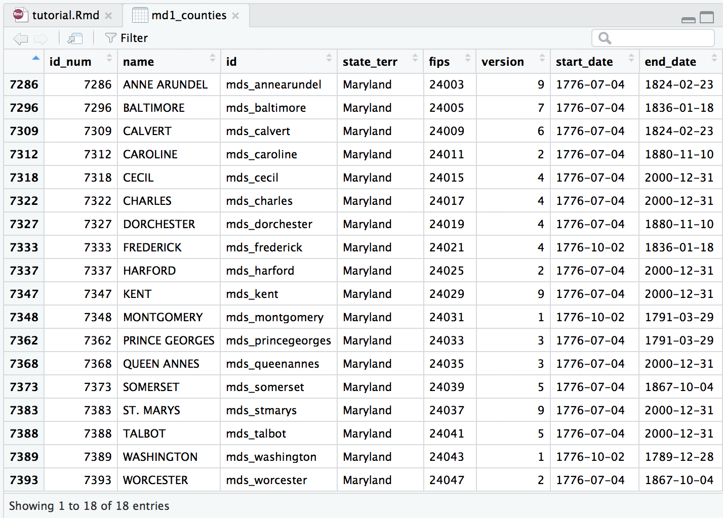
Let’s first look at the second through fifth variables. Compare the observation in these columns to those in either of the MEAE data objects. While the names of these new variable in md1_counties do not exactly match what we’ve seen before, the observations they contain should look familiar. The data in the new variable name matches the data for the variable county in the MEAE data; the new variable id matches the data from county_ahcb; the data in fips matches that in county_fips and so on. Having data that is common between our MEAE data and the spatial data will be key in joining the data together later on.
Next, you’ll see variables for start_date, end_date, change, and citation. When we obtained our spatial data, we stipulated that we wanted spatial data that represented Maryland counties at a specific date. The start_date and end_date show the date range for which the data provided is accurate. For example, the geographic data and boundaries provided here for Frederick County would be accurate from October 2, 1776 until January 18, 1836. The change and citation variables give a reason for boundary or name change, and give a source that this data comes from. Notice that many of these counties were officially formed on July 4th, 1776 when the U.S. declared its independence from Great Britain.
While we won’t examine every variable in md1_counties, the last variable geometry is the most important. This variable lists the exact latitudinal and longitudinal data that creates an outline of each county on a map. While it is important to inspect this data in the Source Editor and make sure that there is data listed for each county (row), it is almost impossible to tell if the data is accurate—i.e. if it will actually produce a map of Maryland—just by looking at the numbers. Instead, we can ask R to plot the data in the geometry variable as a basic map. This will help us confirm that the data we have is accurate. We will use R’s basic graphing function (plot) to do this. We identify that the data we want to plot is from md1_counties and more specifically the variable geometry. We also ask for axes=TRUE so that we can preview the latitude and longitude data to place the map in a larger geographic context.
plot(md1_counties$geometry,axes=TRUE)
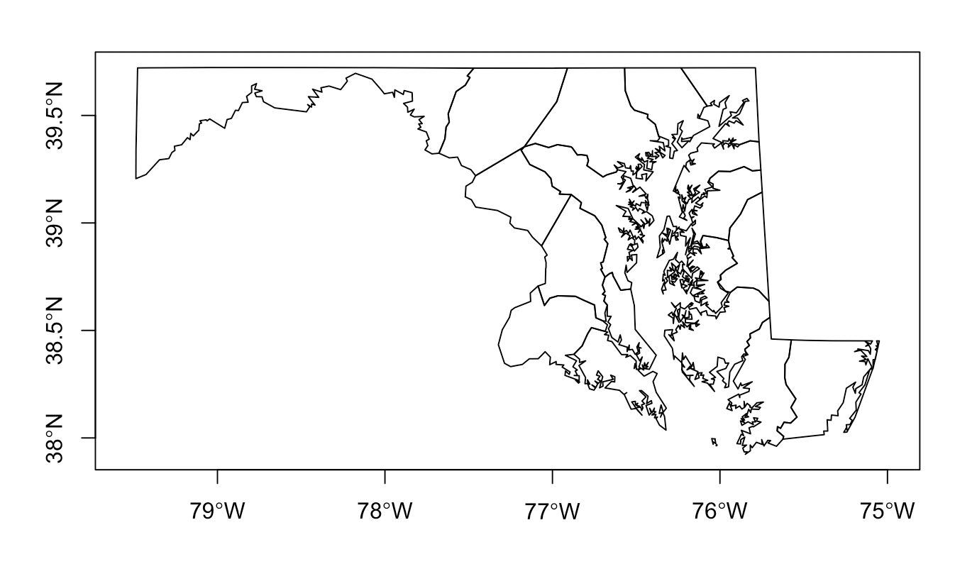
Since the map that R produced looks like Maryland and contains eighteen counties, we know that we have successfully retrieved accurate spatial data.
Joining Elections Data with Geospatial Data
After we have read in and readied our MEAE data for parties and candidates, and have obtained and stored our Maryland county-level data for the January 1789, we need to combine or merge the elections data and the spatial data. We do this by using the function left_join. A join does just what it sounds like—it takes two data objects and joins them together, producing a new data object.
A left join takes the data from your first data object, and looks for matches in the second data object. If it finds a match, it adds the data to the first data object. A left join will always return all the rows from the first data object, even if there is no data that matches in the second data object. Therefore, we will be using a left_join, with md1_counties as the left/first data object, because we want the resulting data object to retain the spatial data for each county, even if there is no party data for a particular county to join to it.
Joining Parties Data to Spatial Data
Let’s start building our function to join the data from md1_counties and md1_parties. First we give a new name md1_counties_parties to the data object that will result from this join. Then we use the left_join function, and specify that the left/first data object we want to use is md1_counties, followed by the right/second data object md1_parties.
md1_counties_parties <- left_join(md1_counties, md1_parties)
However, we are not done yet. If you run this command, you will get an error message telling you that “the data sources have no common variables.”
In order to execute a join, the two data objects you want to join must share at least one variable in common. Without a common variable, R has no way of knowing how the data in the two data objects go together. Therefore, in our join function, we specify a variable that both data objects have in common, and that we would like R to use to join the two data object together. We use the argument by = to inform R what this variable is.
As we noticed while inspecting our spatial data, our MEAE and spatial data do have some variables in common. Nevertheless, R does not recognize that they match because the variable names are slightly different. For example, the variables id (in md1_counties) and county_ahcb (in md1_parties) contain the same data in the form of a county identification code with the same naming convention (mds_countyname). Let’s call this the “County ID.” However, while the data is the same, the names of the variables do not match. We can tell R that these two variables—both representing the County ID—are in fact the same by using "id" = "county_ahcb". (The order here does matter. The variable name used in the left/first data object must come first, and the variable name used in the right/second data object must come second.)
Let’s put all this together in our left_ join function in order to left join md1_parties (right/second) to md1_counties (left/first) by the County ID (where "id = county_ahcb"). Go ahead and run the function. Then make sure that your new data object md1_counties_parties appears in your Global Environment. The function we used is below.
md1_counties_parties <- left_join(md1_counties, md1_parties,
by=c("id" = "county_ahcb"))
Now that you have created md1_counties_parties, open it in the Source Editor by clicking on its name in the Global Environment. We want to inspect the data and make sure that the join worked correctly. At first glance, your new data object should look very similar to md1_counties with eighteen rows of data, one for each county. However, if you scroll to the right, you should see that after the variable state_code, the next variables are meae_id, county_fips, districts, federalist_vote, etc. These are all variables that were not a part of md1_counties and have been placed here by the join.
Another way to check that the join worked correctly is to check the number of observations and variables listed in the Global Environment. The data object md1_counties has 21 variables while md1_parties has 27 variables. If we add the number of variables from the two original data objects together and subtract one (to account for the one common variable that was used to join the data) we get 47, the exact number of variables that md1_counties_parties now contains.
Joining Candidate Data to Spatial Data
Now that we have successfully joined our MEAE parties data and county-level spatial data into md1_counties_parties, repeat the steps above to join the MEAE candidates data with the county-level spatial data to make md1_counties_single_candidate. This data object should have 18 observation of 34 variables. The function we used is below.
md1_counties_single_candidate <- left_join(md1_counties,
md1_single_candidate, by=c("id" = "county_ahcb"))
Congratulations! You have now successfully read-in all the MEAE data, obtained the spatial data, and joined the data to create two new data objects that each have elections and spatial data. We are now ready to visualize our data by creating choropleth maps!
Visualizing: Maps
When creating geographic visualizations in R, you have many options. There are several different packages and functions that you can use. We’ve already used one of the most basic functions plot() to check our spatial data earlier. For this tutorial, we are going to demonstrate how to use two different packages, ggplot2 (part of the tidyverse package) and leaftlet to make choropleth maps—maps which show geographic regions colored or shaded according to some variable.
ggplot2 creates simple, static maps that are quite customizable directly in R. For additional information about using ggplot2, we recommend looking at the package’s documentation or Kieran Healy’s Data Visualization: A practical introduction, especially Chapter 7 about maps.
leaftlet creates interactive maps that can be zoomed in and out, and have click or hover-over labels. However, these maps are made with JavaScript (another programing language) and are therefore a bit more difficult to create in R. For additional information about using leaflet, we recommend looking at the package’s documentation.
We recommending trying both kinds of maps and then deciding what works best for you.
Mapping Party Percentages - ggplot2
First are going to make a ggplot2 map that shows the percentage of the vote received by the Federalist party/faction in each county during Maryland’s First Congressional election. We start our function ggplot() by telling R that we want to work with the data object md1_counties_parties, since this contains our spatial data and our MEAE data for party percentages.
ggplot(md1_counties_parties)
Next, we need to add what is called a “geom” or geometry in ggplot2. You can think of this like telling R to create a layer of shapes or dots. We will use geom_sf which provides several “simple features” (sf) or tools to help manipulate spatial data. In our case, geom_sf will create outlines of each county in Maryland like we saw with our earlier plot of the spatial data. Inside the geom_sf function, we need to tell R what specific data from our data object md1_counties_parties that we would like use to fill in each of these county outlines. Because we want our each of counties to be filled in with a gradient that shows the percentage of the vote received by the Federalist party, we add aes(fill = federalist_percentage) to our geom to tell R to pull data from the variable federalist_percentage.
Finally, we have to tell R how to make the scale that will regulate the shading or gradient. Here we are going to rely on ColorBrewer which provides already made color schemes that are particularly suited to displaying values on maps. Here we use one of the four ColorBrewer functions that ggplot2 recognizes: scale_fill_distiller(). We use “fill” because we have (county) outlines that we want to fill in (vs. “colour” which plots a single point on a graph) and “distiller” because we have continuous numerical data (vs. “brewer” which plots categorical data).
Within scale_fill_distiller() we can provide some additional information to help R build our scale. We name the scale “Percent of Vote.” We specify that the color palette should be “Greens.” (You can use whatever color suits your fancy, but we have used “Greens” here because MEAE uses green to represent the Federalist Party.) We tell R that if there is no data available (“NA”) for a county, the county should be filled in with the color white. (Again, you could pick another color here like grey if you want.) Next we specify the direction the scale should go. Should the largest percentage of the vote be represented by the darkest color or the lightest color? Since we want the former, we use direction = 1. Finally, with labels = we specify how we want the legend to look. We use scales::percent to tell R that the data we are using should be displayed as percentages. Now you are ready to run your code and create your first map. The code we used is below.
ggplot(md1_counties_parties) +
    geom_sf(aes(fill = federalist_percentage)) +
    scale_fill_distiller(name = "Percent of Vote",
                         palette = "Greens",
                         na.value = "white",
                         direction = 1,
labels = scales::percent) 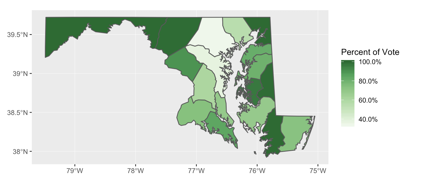
Good job! You have just made you first choropleth map with MEAE elections data. Now that the actual map part is created, you can play around with other options to make your map presentation ready. In our example below, we added a title and adjusted its size and alignment, we took away the tick marks and text on both axes, and removed the grey background and border around the map.
ggplot(md1_counties_parties) +
    geom_sf(aes(fill = federalist_percentage)) +
    scale_fill_distiller(name = "Percent of Vote",
                         palette = "Greens",
                         na.value = "white",
                         direction = 1,
                         labels = scales::percent) +
  labs(title ="Federalist Vote Percentage - MD1") +
  theme(plot.title = element_text(size=14, hjust = 0.7),
        axis.ticks = element_blank(),
        axis.text = element_blank(),
        panel.background = element_blank(),
        panel.border = element_blank())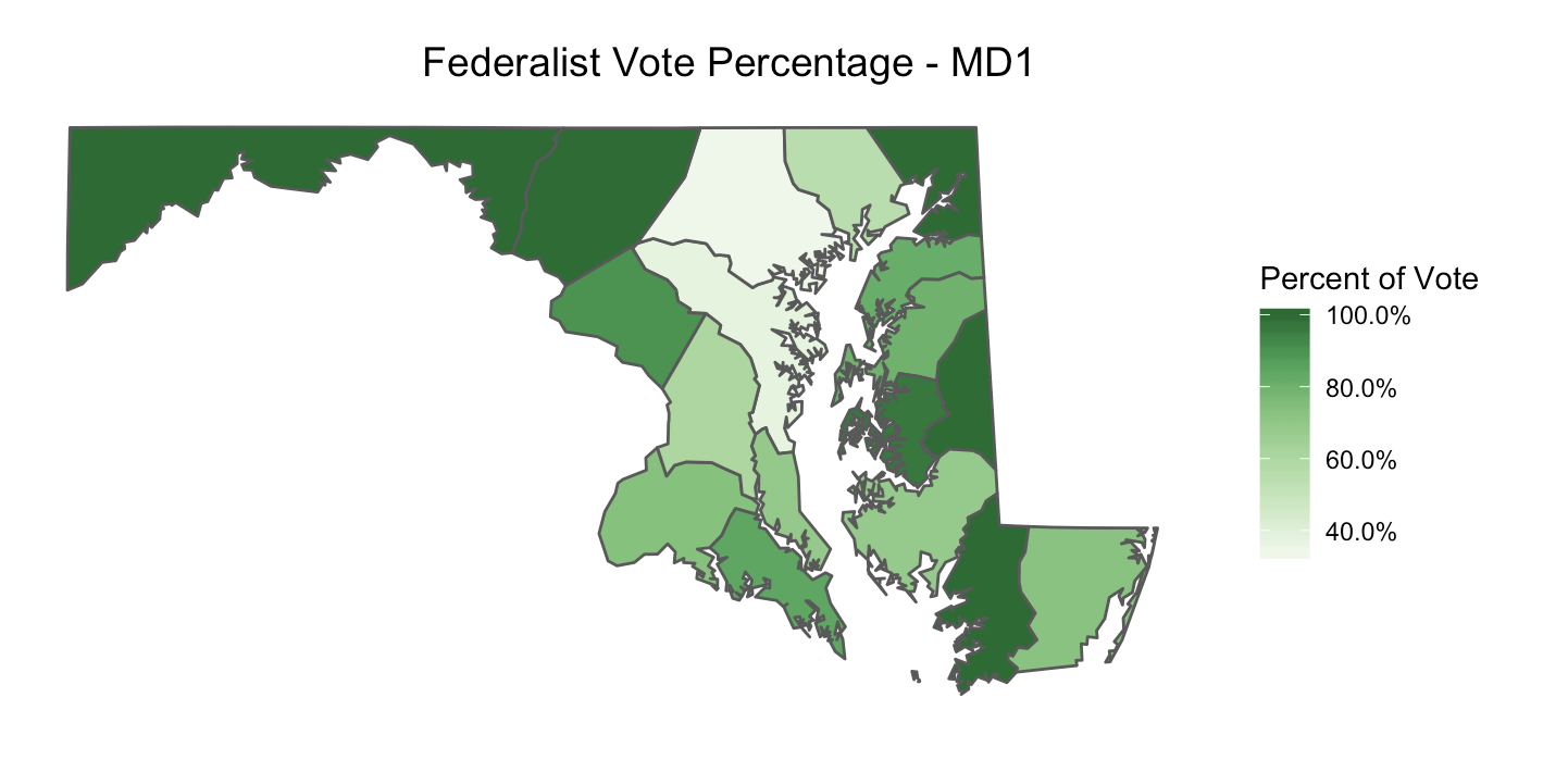
Going Further with Party Percentages - ggplot2
Now that you have learned how to make a choropleth map in ggplot2 using md1_counties_parties to show the Federalist vote percentage, you can use the same steps to make different kinds of party maps.
For example, you could create a map of the Anti-Federalist (instead of Federalist) vote percentages by slightly modifying the above code:
change the variable name in the
geom_sffromfederalist_percentagetoantifederalist_percentagechange the color of the palette in
scale_fill_distillerto something else. We recommend"Oranges", as this is the color MEAE uses to represent Anti-Federalistschange the title of map to something like
"Anti-Federalist Vote Percentage - MD1"
Here is the code we used and the map it produced.
ggplot(md1_counties_parties) +
    geom_sf(aes(fill = antifederalist_percentage)) +
    scale_fill_distiller(name = "Percent of Vote",
                         palette = "Oranges",
                         na.value = "white",
                         direction=1,
                         labels = scales::percent) +
    labs(title="Anti-Federalist Vote Percentage - MD1") +
    theme(plot.title = element_text(size=14, hjust = 0.7),
        axis.ticks = element_blank(),
        axis.text = element_blank(),
        panel.background = element_blank(),
        panel.border = element_blank())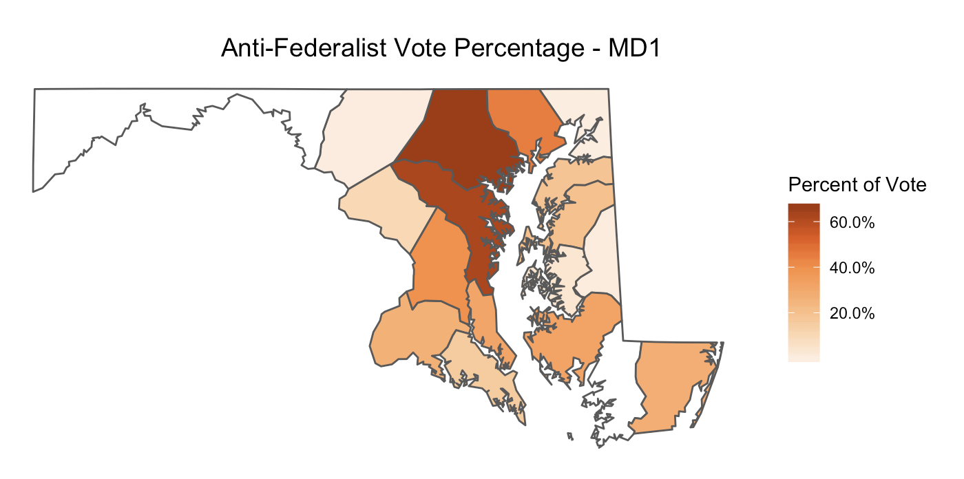
Or, you could create a map of Federalist vote totals (instead of percentages) by slightly modifying the above code:
change the variable name in the
geom_sffromfederalist_percentagetofederalist_votechange the name of the scale from
"Percent of Vote"to"Votes"remove
labels = scales::percentchange the title of map to something like
"Federalist Vote Totals - MD1"
ggplot(md1_counties_parties) +
    geom_sf(aes(fill = federalist_vote)) +
    scale_fill_distiller(name = "Votes",
                         palette = "Greens",
                         na.value = "white",
                         direction = 1) +
    labs(title ="Federalist Vote Totals - MD1") +
    theme(plot.title = element_text(size=14, hjust = 0.7),
        axis.ticks = element_blank(),
        axis.text = element_blank(),
        panel.background = element_blank(),
        panel.border = element_blank())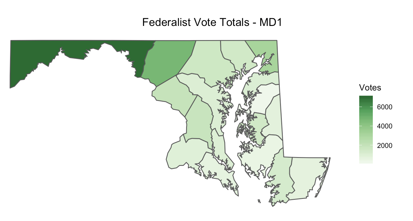
Of course, if you are using a state other than Maryland or a Congress other than the First, the parties will be different, giving you a world of possible maps to create.
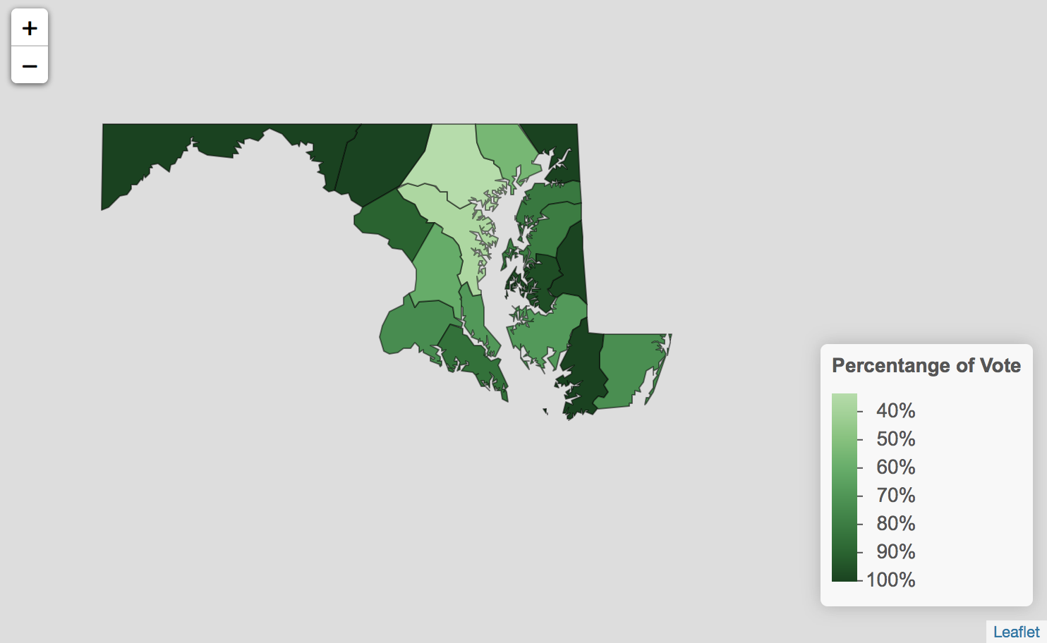
Party Percentages - leaflet
Now we are going to create a leaflet map that shows the percentage of the vote received by the Federalist party/faction in each county during Maryland’s First Congressional election. Unlike in ggplot2 where we could describe the color scale we wanted as a part of the ggplot function, in leaflet we must start by creating a separate function that tells leaflet how to create the scale we want. We store this function as federalist_percent_colors and use the function colorNumeric to tell leaflet that we want to create a color scale based on numbers. We specify the palette we want to use is "Greens". (Again in MEAE, Federalists are represented by green, but you can make this a color of your choosing.) Finally, we have to define a domain for this scale. leaflet wants to know the lowest and highest values (numbers) in our scale. Remember that we are mapping the Federalist percentage of the vote and our votes percentages are stored as decimals ranging from zero to one. Because of this, we use domain = 0:1.
federalist_percent_colors <- colorNumeric(palette = "Greens", domain = 0:1)
Now we are ready to create our mapping function. We start our function leaflet() by telling R that we want to work with the data object md1_counties_parties, since this contains our spatial data and our MEAE data for party percentages. Then we use what is called a “pipe” %>% to tell R to take what we have just inputed and use it in the next line. You can think of it like the phrase “and then.” On the next line we are adding a layer to our map with the function addPolygons(). So it is like saying “create a leaflet map with the data md1_counties_parties, and then add Polygons.”
In our case, addPolygons() will create outlines of each county in Maryland, just like geom_sf did in ggplot2. Inside the addPolygons() function, we need to give leaflet some more information about how we would like to fill in each of these county outlines. Because we want each of our counties to be filled in with a color gradient based on the federalist_percent_colors function we just created, we specify that the fillColor = ~federalist_percent_colors(federalist_percentage). This tells leaflet to fill in the county outlines/polygons by using the function federalist_percent_colors and specifically, to use the data from the variable federalist_percentage. Next, we specify that we would like the fillOpacity (the transparency of the color filling the outline) be to set to one. (0 is equivalent to fully transparent/no color, and .5 is equivalent to 50% transparency.) Finally we can describe our preferences for the polygons’ outlines. We set the color to "black" and the weight to 1. (A higher number for the weight would result in a thicker outline, while a smaller number would result in a thiner outline.) We can run the code below to make sure that we have added our polygons correctly.
federalist_percent_colors <- colorNumeric(palette = "Greens", domain = 0:1)

leaflet(md1_counties_parties) %>%
 addPolygons(fillColor = ~federalist_percent_colors(federalist_percentage),
             fillOpacity = 1,
             color = "black",
             weight = 1)
Notice that this leaflet map is interactive instead of static. Try dragging the map around or zooming in or out.
Great! Now that we have a map of Maryland with the counties filled in with a green gradient, we need to add a legend to show what percentages the fill colors correspond with. We use a %>% to tell leaflet that we have more to add to our map. Then on the next line, we add an additional layer for the legend with the function addLegend(). Then we give leaflet the information it needs to build the legend. We specify the position of the legend should be in "bottomright" corner of our map. pal asks what colors it should use in the legend. We specify that we want to use the color scale created in our function federalist_percent_colors. We also tell it that the values are coming from the variable ~federalist_percentage. We give the legend a title and set the opacity at 1 so that the legend is not transparent. Finally, just like we told ggplot to display our data as percentages (instead of in decimal form) with the command labels = scales::percent, here we instruct leaflet to do the same thing with the command labFormat = labelFormat(suffix = "%", transform = function(x) {x*100}. This tells leaflet to transform the data by multiplying it by 100 and then adding a percent sign to the end of the number. The code we used to build our legend is below.
 addLegend(position = "bottomright", pal = federalist_percent_colors,
    values = ~federalist_percentage,
    title = "Percentange of Vote", opacity = 1,
    labFormat = labelFormat(suffix = "%", transform = function(x) { x*100 })
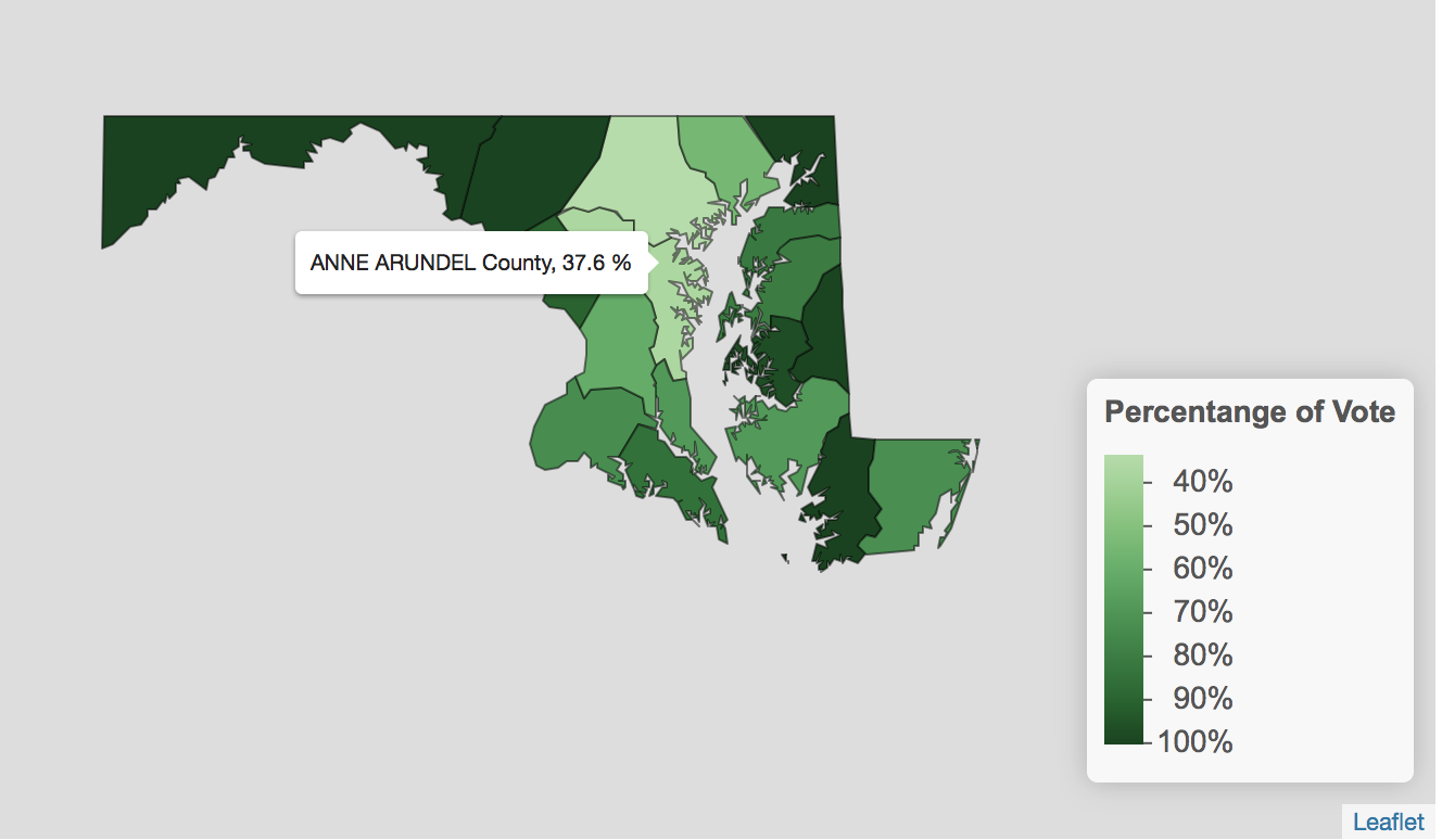
Going Further with Party Percentages - leaflet
While a leaflet map can be more difficult to build, it also offers extra, sometimes useful features such as a label when one hovers or clicks on data. For example, we might want to add a label that would appear when you hovered your mouse over each county, giving the county name and the exact percentage of the vote received by the Federalist party. We would do this by adding a line of code inside of our addPolygons() function. We might use the code: label = ~paste(name, " County,", (federalist_percentage*100),"%")).
In this code, name and federalist_percentage are two variables from md1_counties_parties that gives the county name and percent of the Federalist vote respectively. This means that when leaflet is creating a label for each county, we want it to go find the data in the name and federalist_percentage variables for that county and paste it in the label. Remember that we have to multiply the data from the the federalist_percentage column by one hundred to transform it from a decimal to a percent. Finally, the word “county” and symbol “%” literally mean, paste the word county and the percent sign in each label.
The code below creates a leaflet map with all of the options we have discussed. Notice that when you hover over county, you can now see the county’s name and the percent of the vote Federalist received in that county.
federalist_percent_colors <- colorNumeric(palette = "Greens", domain = 0:1)

leaflet(md1_counties_parties) %>%
 addPolygons(fillColor = ~federalist_percent_colors(federalist_percentage),
             fillOpacity = 1,
             color = "black",
             weight = 1,
             label = ~paste(name, " County,", (federalist_percentage*100),"%")) %>%
 addLegend(position = "bottomright", pal = federalist_percent_colors,
    values = ~federalist_percentage,
    title = "Percentange of Vote", opacity = 1,
    labFormat = labelFormat(suffix = "%", transform = function(x) { x*100 }))
Bravo! You have successfully created choropleth maps of MEAE parties data using two different packages, ggplot2 and leaflet. You could easily modify the code from either the ggplot2 or leaflet map to create your own choropleth maps the show the number of votes or percentage of the vote for any of the states, elections or parties in the MEAE dataset.
Mapping A Single Candidate’s Votes
While we have now created maps that show the number of votes or percentage of the vote received by a single party or faction, wouldn’t it be great to see how a particular candidate from that party faired in the election? In what counties did a particular candidate do well? Where did a candidate not do so well? We can now use the skills you learned building maps of party percentages to do just that.
First, let’s remind ourselves about the variables and observation in our data object md1_counties_single_candidate (holding our MEAE candidate data and spatial data) by opening it in the Source Editor. Let’s scroll over to the variables candidate, candidate_id, and vote. Remember that we have filtered this data so the data object only contains MEAE data for a single candidate, Joshua Seney, joined to the spatial data. If you later desire to create a map that shows the votes of a different candidate, you can do this by returning to the beginning of you R Markdown file and replacing Joshua Seney’s candidate_id with that of your desired candidate in the filter() function, and re-running all of your code, including your spatial join code.
Mapping A Single Candidate’s Votes - ggplot2
Now we can use what we learned while making a ggplot2 party percentage map to make a map that shows the number of votes received by a single candidate. We can do this by slightly modifying the code we created above. This time, we want to use md1_counties_single_candidate as the data for our map by placing it inside the ggplot() function. Next we want to use the variable vote (representing the number of votes the candidate received) as the fill. We name the scale "Number of Votes", remove the labels = scales::percent command, since we are dealing with votes instead of percentages, and give the map a title like "Votes for Federalist Joshua Seney - MD1". The code we used and map it created is below.
ggplot(md1_counties_single_candidate) +
    geom_sf(aes(fill = vote)) +
    scale_fill_distiller(name = "Number of Votes",
                         palette = "Greens",
                         direction=1) +
    labs(title="Votes for Federalist Joshua Seney - MD1") +
    theme(plot.title = element_text(size=14, hjust = 0.7),
        axis.ticks = element_blank(),
        axis.text = element_blank(),
        panel.background = element_blank(),
        panel.border = element_blank())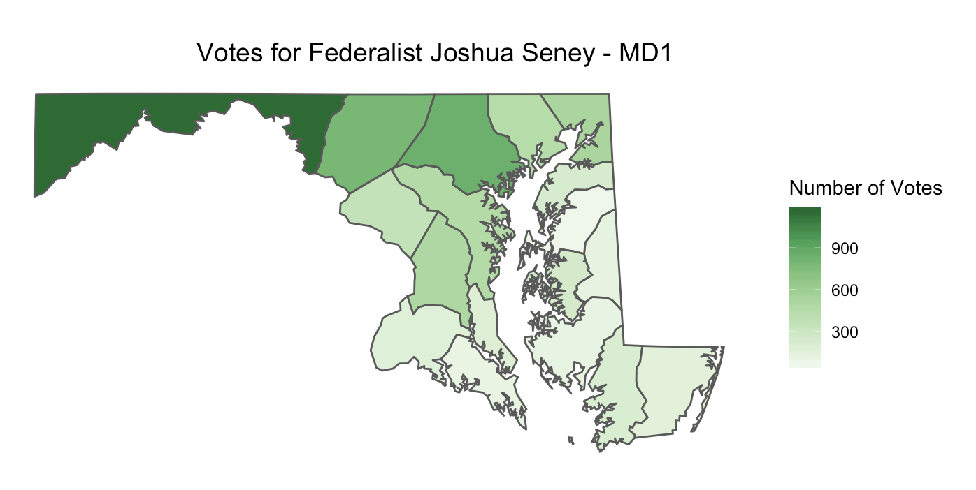
Great job in creating yet another map with ggplot2! Notice that Joshua Seney received more votes in the west than the east, even though he is from Queen Ann’s County on Maryland’s Eastern Shore. You can tell this, because the counties in the west should be shaded with a darker green color. Also, notice that because this is an At-Large election (meaning that candidates received votes in all counties), all eighteen counties are filled in with some color. If this was a district election, Joshua Seney would have only received votes in his own district, and only the counties in his district would be colored in.
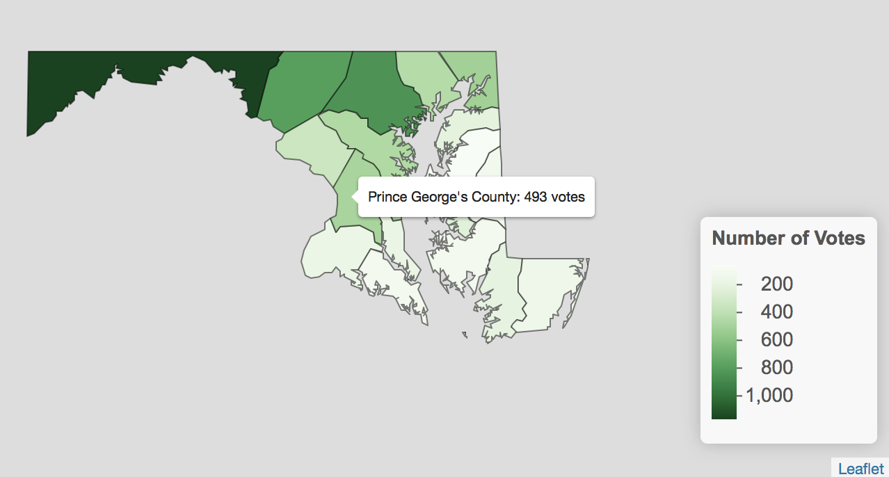
Mapping A Single Candidate’s Votes - leaflet
Similarly, we can modify the leaflet code we used to create a party percentage map in order to make a map that shows the number of votes received by our single candidate, Joshua Seney.
The first change comes in the function that tells leaflet how to create the color scale for our map. When we were creating a map of party percentages, we specified a domain from zero to one because we easily knew the lowest and highest values in the scale. In this case, we are dealing with vote totals and we do not automatically know what are the lowest and highest values. So in this case, we are going to let ColorBrewer help us automatically create the best color scale based on the data we have. Therefore, we define the domain as md1_counties_single_candidate$vote, which tells leaflet the data object, followed by the specific variable within that data object that we want it to use to calculate the scale.
colors_candidate <- colorNumeric(palette = "Greens",
                                 domain = md1_counties_single_candidate$vote)
Next, we’ll make a few modifications to the leaflet code we used previously. This time, we want to use md1_counties_single_candidate as the data for our map by placing it inside the leaflet() function. Next we want to use our function colors_candidate followed by the the variable vote (representing the number of votes the candidate received) as the fillColor. We change the table so that it uses the variables county (for the county name), and vote (for the number of votes). Finally, we adjust the legend so that pal uses our function colors_candidate, the values are drawn from the variable vote, the scale is called something like "Number of Votes", and we have removed the labFormat function, since no suffix or transformation of the data is needed. The code and map we created is below.
colors_candidate <- colorNumeric(palette = "Greens",
                                 domain = md1_counties_single_candidate$vote)

leaflet(md1_counties_single_candidate) %>%
  addPolygons(fillColor = ~colors_candidate(vote),
              fillOpacity = 1,
              color = "black", weight = 1,
              label = ~paste(county, " County:", vote, " votes")) %>%
 addLegend(position = "bottomright", pal = colors_candidate,
           values = ~vote, title = "Number of Votes", opacity = 1)
Conclusion
Congratulations! You have accomplished a lot in this tutorial. Just to recap, you’ve learned how to read-in and inspect our MEAE data, how to obtain historical county-level spatial data, how to join the MEAE data to the spatial data, how to create party percentage maps in gglopt2 and leaflet, and how to create a map of an individual candidate’s votes in gglopt2 and leaflet.
Most importantly, this tutorial should have provided you with a basic template for taking MEAE data and using geospatial analysis to analyze phenomenons such a candidate’s votes, a party’s votes, or a party’s percentage of the vote. However, this is just the beginning of the possible kinds of maps or means of inquiry you can carry out using the MEAE dataset. Using the methods outline above, you can continue to investigate by creating choropleths with other variables, for other Congresses, or for other states in the MEAE dataset.
